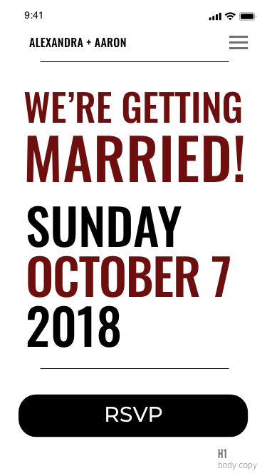
A case study on creating an RSVP site for a Wedding
So…I got married in 2018 and it was amazing. Definitely one of the best days of my life! Leading up to that day, my hope was to create a website that could capture the spirit of what we wanted to put out there for our guests. It was a perfect opportunity to put my UX & Visual Design skills to use and hopefully learn a thing or two. In the process, I learned quite a bit.
First things first, this was not the usual UX & visual design project. This was a website, for a wedding, my wedding, that needed to go up quickly and efficiently. The biggest lesson from this is to get your biggest stakeholder(s) on board. It’s their site and you’re working for them—and with them—especially when one of the stakeholders happens to be your future wife. However, as a stakeholder myself, and as the Lead designer, I too had opinions (and research) on what should be on the site. This lead to a lot of back and forth throughout the process, mainly about the content, as she trusted me on the visual design. The back and forth was a good thing. It helped me to understand just how much an emotional investment a site can be.
Designing for humans will never go a planned.
While most of the people who were to use the site, would only come in to get what they need, that was not the case for everyone. So, trying to design with the idea of keeping them on the page to enjoy the “experience” turned out to be a “nice in theory” but not in practice. The guests — we provided the special link on the invitations—came solely to get the information they needed and whatever they couldn’t find, they reached out to us, instead of searching the site. This was something that was discovered when conducting interviews with potential guests, however, we wanted to be sure that we provided as much information as we thought was necessary.
Lesson Learned
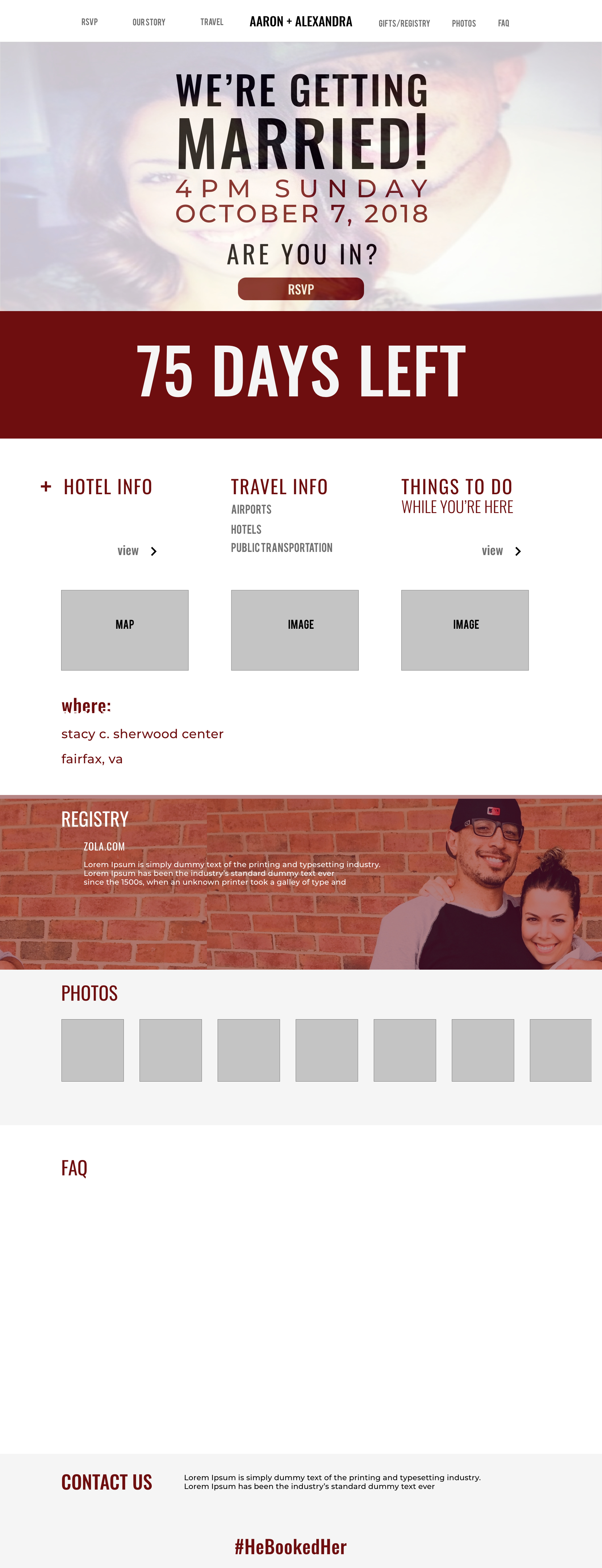
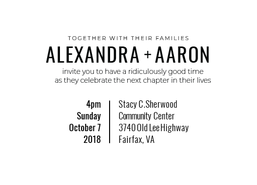
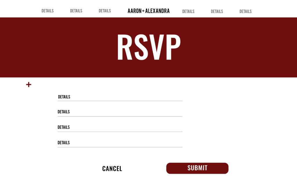
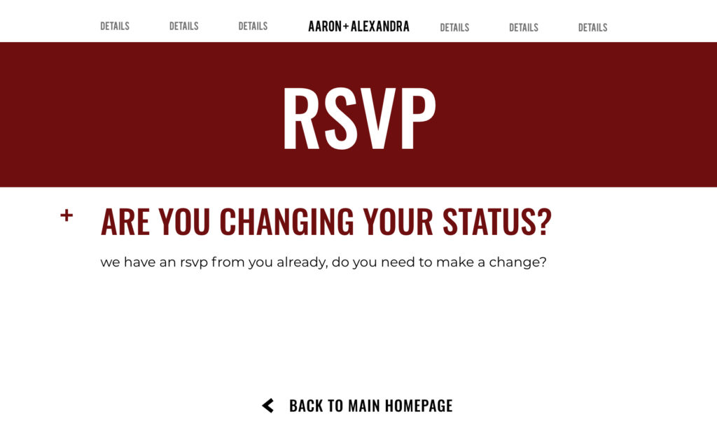
As a UX Designer, you’re equipped with the knowledge that when designing a site for yourself, you’re actually not designing for yourself, you’re designing for the users of the site. That gets lost when it’s something as big as a wedding site. When the biggest stakeholder is your significant other and the main users are family and friends, that knowledge isn’t as useful when you’re trying to articulate the correlation of the naming conventions of the top navigation links.
It was hard, time consuming but a great learning experience. However, I do hope that I don’t have to do it again. Fingers crossed.
